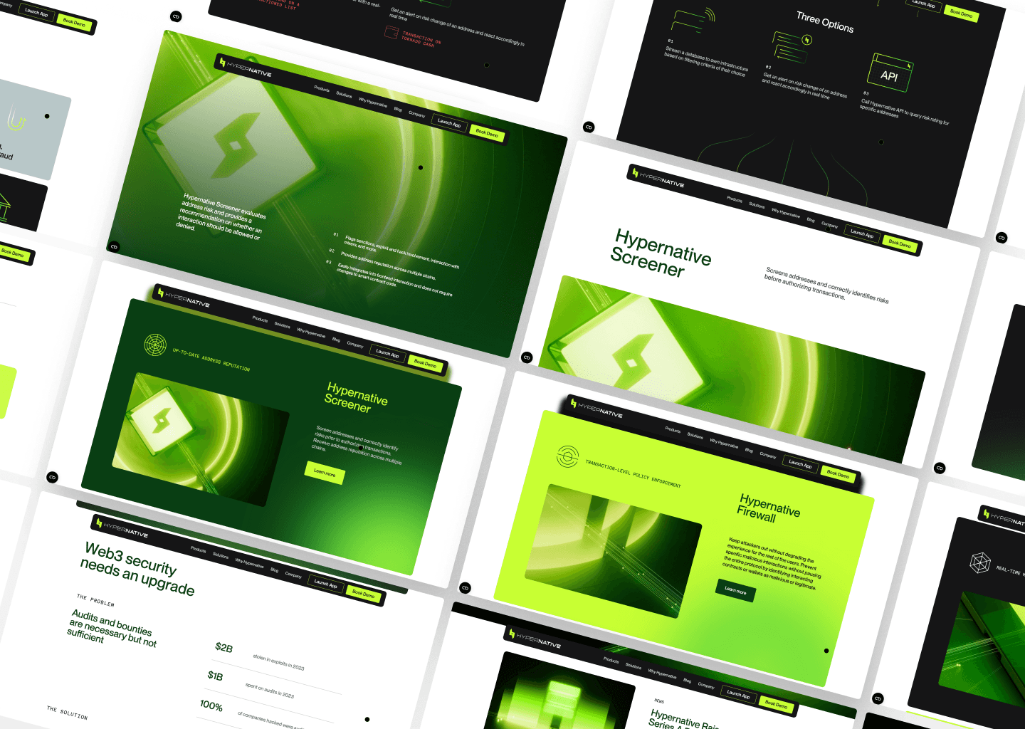
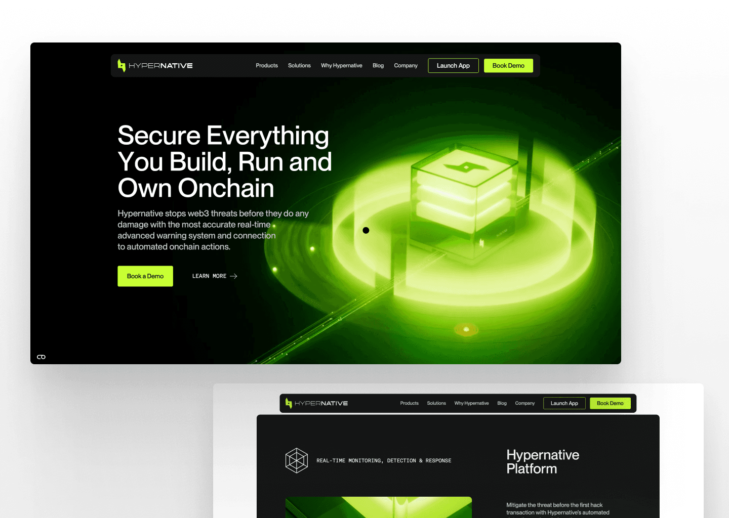
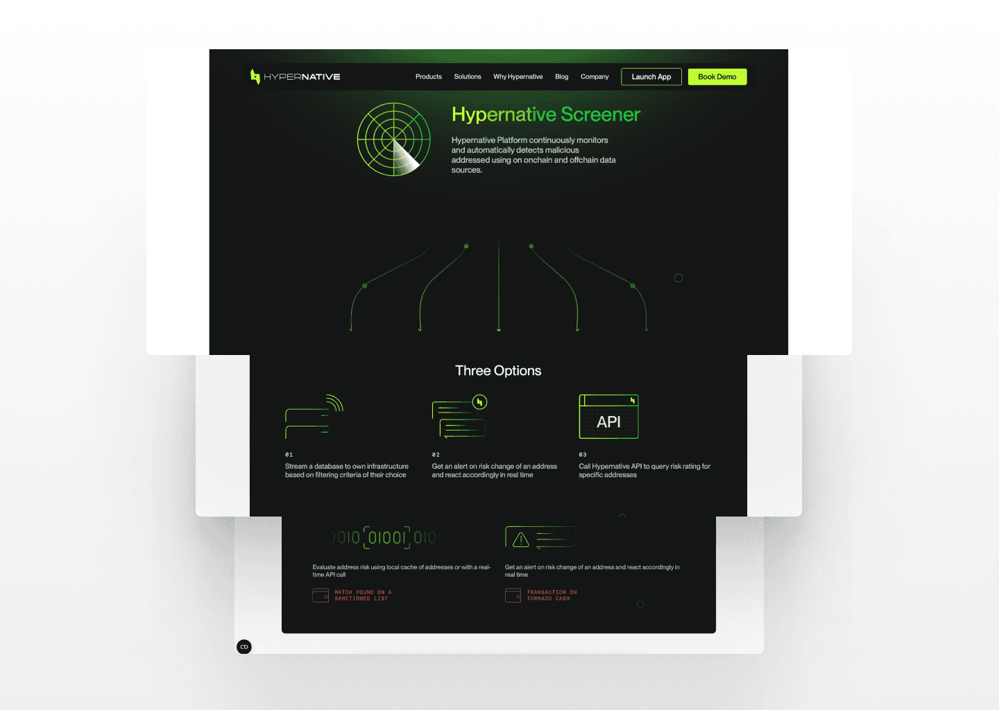
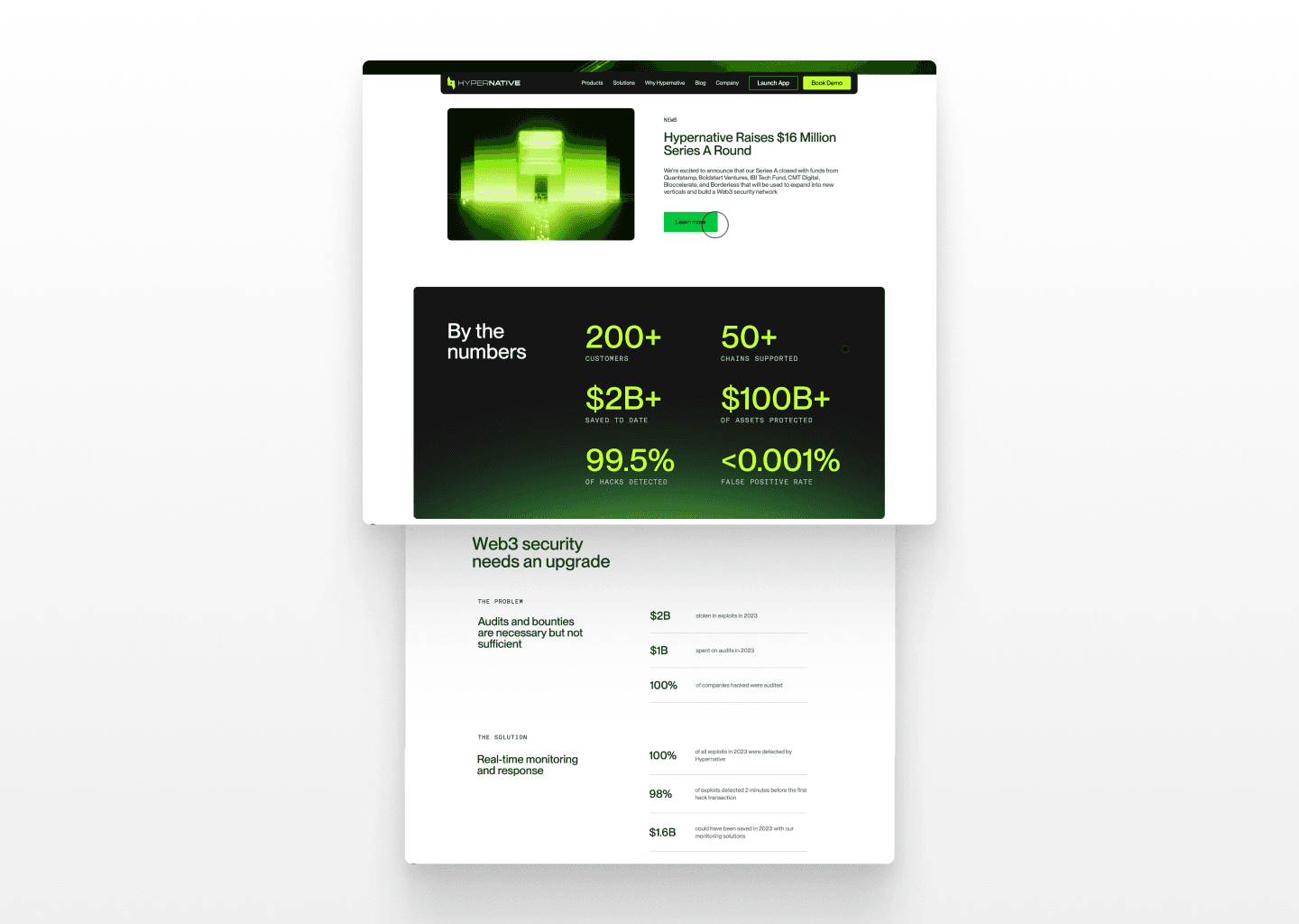
Hypernative is reshaping Web3 security by predicting and preventing threats before they happen. When I joined the project, it was clear there was potential to elevate the platform into a product that feels powerful, intuitive, and polished.
I stepped in to improve key areas of the platform — from navigation flows to data visualization — ensuring every touchpoint felt intentional and aligned with user needs.
The Experience
Hypernative’s platform is more than just a collection of tools. It’s a place where security professionals make critical decisions in real time. The goal? Make every click count.
From the navigation system overhaul to redesigned dashboards, the focus was always on clarity, speed, and usability.
💡 Key Enhancements:
A Clean, Intuitive Navigation:
I rethought how users move through the platform to reduce friction and surface essential features faster.
2. Simplified Data Analytics:
Complex data should be easy to understand. I focused on presenting insights clearly, helping users spot threats quickly.
3. Agency Builder:
Partners can now create their own screeners effortlessly, scaling Hypernative’s reach.
Design Philosophy: The Balance of Bold & Secure
Every design decision was driven by one question: How do we make users feel in control of their security?
The aesthetic approach was about confidence without intimidation.
We wanted users to feel they were navigating something powerful, yet approachable.
The result?
A platform that’s polished, scalable, and easy to trust.
The Impact (and What’s Next)
These changes laid the groundwork for a more seamless and scalable experience as the platform grows. I continue to support the team, refining the product based on user feedback and shaping new features that keep Hypernative ahead of security threats.

