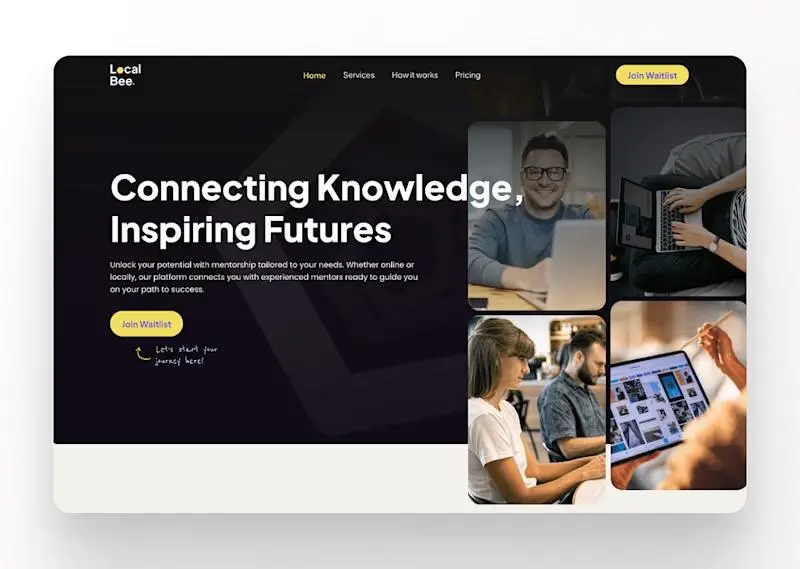
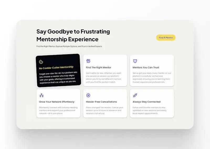
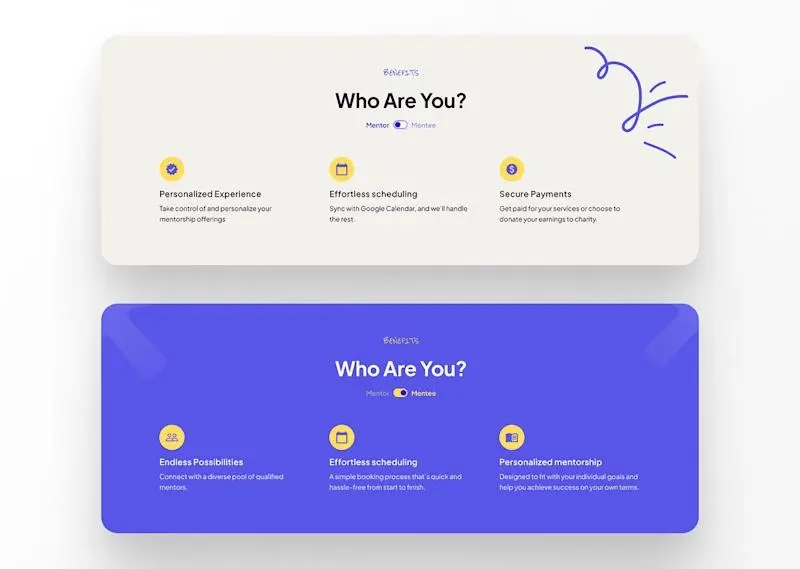
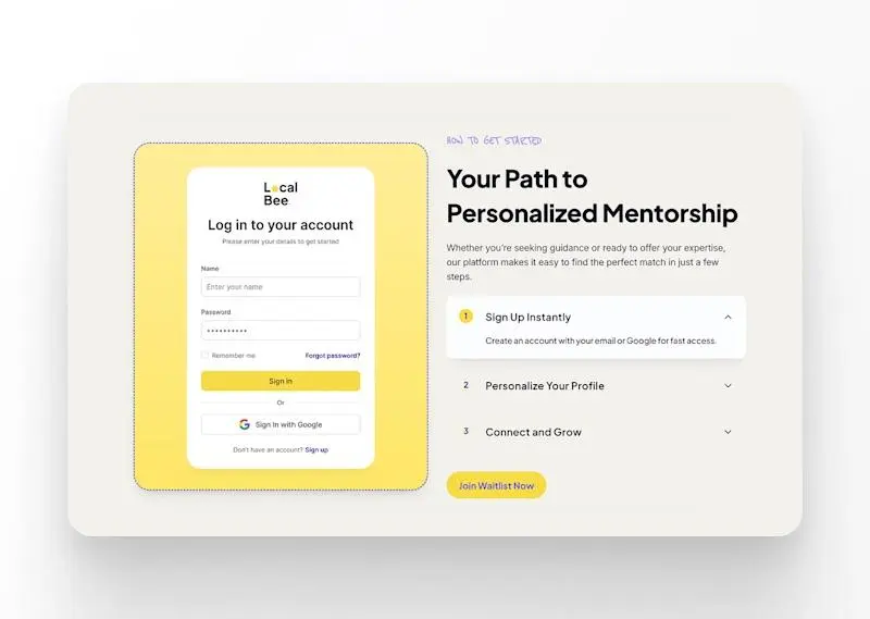
Local Bee is all about making mentoring accessible and effortless. Whether you’re looking for a mentor or want to offer your expertise, this platform connects people in a simple, intuitive way.
The goal? Create a platform that’s easy to use, visually engaging, and bridges the gap between mentors and mentees without all the complexity.
My Role
I handled the whole thing - UX, UI, copywriting, design, and development—using Framer to bring it all together. From the initial wireframes to the final build, I made sure Local Bee was not only functional but also a seamless and enjoyable experience for users.
The Challenge
Mentoring is personal, but most platforms make it feel overly formal or complicated. The challenge was to create a space where people can connect easily, without getting bogged down by unnecessary features or confusing navigation. The goal was to keep everything simple yet effective, and above all, user-friendly.
Strategy & Research
I did a deep dive into competitor platforms and user research to figure out what worked, and what didn’t - when it came to mentoring services. Users wanted something that didn’t feel overwhelming, with straightforward navigation and easy access to mentors. Armed with this insight, I focused on creating a clean, minimalistic design that put users first, making the process of finding or becoming a mentor as frictionless as possible.
Design & Development
Wireframes & Prototypes: I started by mapping out the user journey and building out wireframes. Once the flow was solid, I jumped into high-fidelity prototyping in Framer, making sure everything looked sharp and worked smoothly across devices.
Key Features: The platform’s key feature is its simplicity. It’s easy to sign up, find a mentor, or offer mentorship, with clear CTAs guiding users through each step. Smooth transitions and a clean layout keep the focus on connections, not clutter.
Development: Built entirely in Framer, the platform is responsive and optimized for mobile and desktop. I worked to ensure that every interaction was smooth, making mentoring accessible to everyone, regardless of their tech skills.
Tools Used: I used Figma for the initial designs and later on Framer was my go-to tool for both design tweaks and development, keeping the process efficient and cohesive.
Challenges & Solutions
One of the biggest challenges was keeping the site simple without stripping away important features. I worked to find the balance between functionality and minimalism, making sure the user journey felt intuitive. Performance was another key focus—mentorship shouldn’t be a struggle, and neither should navigating the site. By optimizing design assets and code, I kept the site fast and responsive.
Results & Impact
The Local Bee platform is set to officially launch soon, but the early design and development work has already garnered interest. Currently, the platform is in the process of seeking investors who are excited about betting on this innovative approach to simplifying mentorship. With a solid foundation in place and a user-centric design, Local Bee is primed to make a significant impact once it hits the market. The feedback so far has been overwhelmingly positive, and it’s clear the platform is on the right track to becoming a game-changer in the mentoring space.
Key Takeaways
This project really drove home the importance of user-centered design. By focusing on making mentoring as easy as possible, I learned that simplicity and clear navigation are essential, especially for platforms that aim to connect people. Using Framer allowed me to design and build efficiently, making sure the vision for Local Bee came to life seamlessly.
