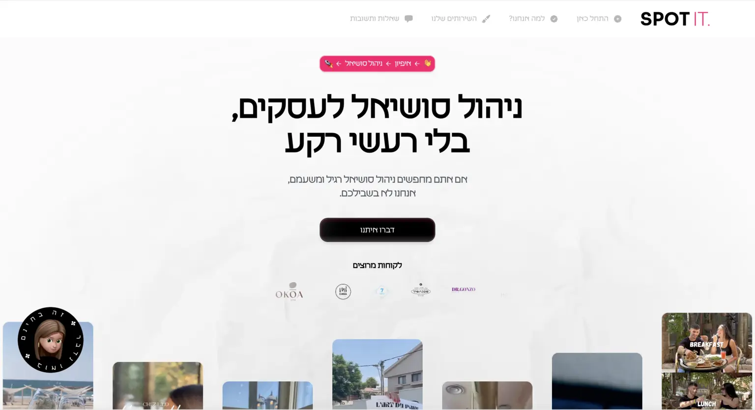
SpotIt Agency is a dynamic digital agency aimed at helping businesses shine online. The website needed to be sleek, modern, and built to convert visitors into clients.
SpotIt provides a range of services, from brand strategy to web design and marketing, all wrapped up in a visually engaging and highly intuitive experience. The challenge was to create a platform that communicated the agency’s expertise while remaining user-friendly for both potential clients and internal teams managing the site.
Design Highlights:
Engaging Homepage:
The SpotIt Agency homepage greets users with bold typography, high-impact visuals, and a clear call to action. It quickly communicates the agency’s core services—branding, web design, and digital marketing. I ensured that the homepage isn’t just about aesthetics but is optimized for fast loading times and mobile responsiveness, giving visitors an efficient, pleasant experience on any device.
Services Overview:
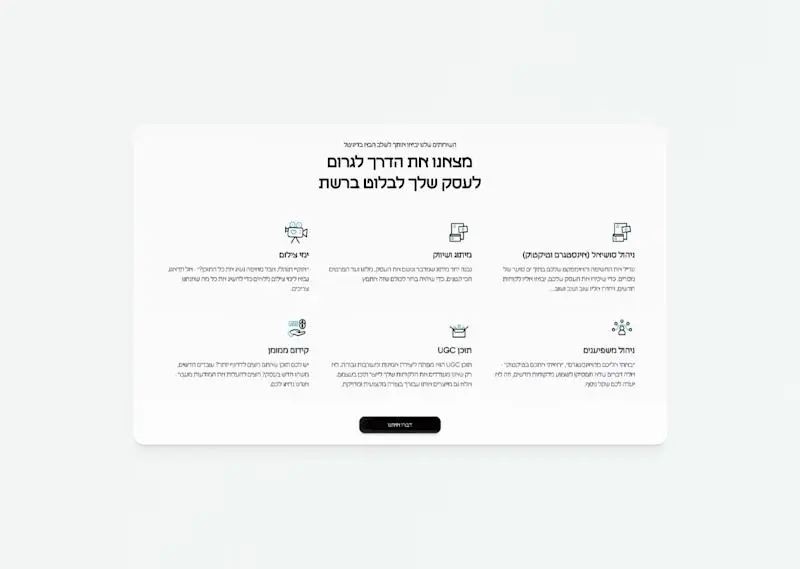
The services page is clean and minimalist, focusing on clear descriptions paired with imagery that supports the offerings. I focused on keeping the content approachable yet informative, helping users immediately grasp the value SpotIt provides without needing to wade through marketing jargon.
Portfolio and Case Studies:
Showcasing the agency’s portfolio was a key feature of this design. The case studies section presents projects in an interactive and engaging manner, using visual storytelling techniques. With smooth transitions and hover animations, users can easily explore the breadth of work, adding an element of discovery that enhances user engagement.
Contact Form and Lead Generation:
The contact page is designed with conversion in mind. Clear, bold CTAs guide users to get in touch, and the form is short, simple, and efficient—encouraging more leads by removing unnecessary barriers. Plus, I’ve integrated the backend with CRM tools to streamline lead management for the SpotIt team.
User-Centric Navigation:
The navigation is designed to get users where they need to go without confusion. A sticky header follows users as they scroll, ensuring they can easily access any part of the site. The menu structure is intuitive, keeping the most important sections like services, portfolio, and contact just a click away.
User-Centric Design:
The overall design of SpotIt Agency is modern, sleek, and focused on user experience. I ensured that users—whether clients, potential clients, or SpotIt team members—can easily navigate the site and find exactly what they need. It’s designed to be scalable and easy to manage, giving the team flexibility as they grow.
