Develeap
Designing a DevOps site
site that doesn’t feel like
DevOps
SaaS
Conversion Design

Challenge
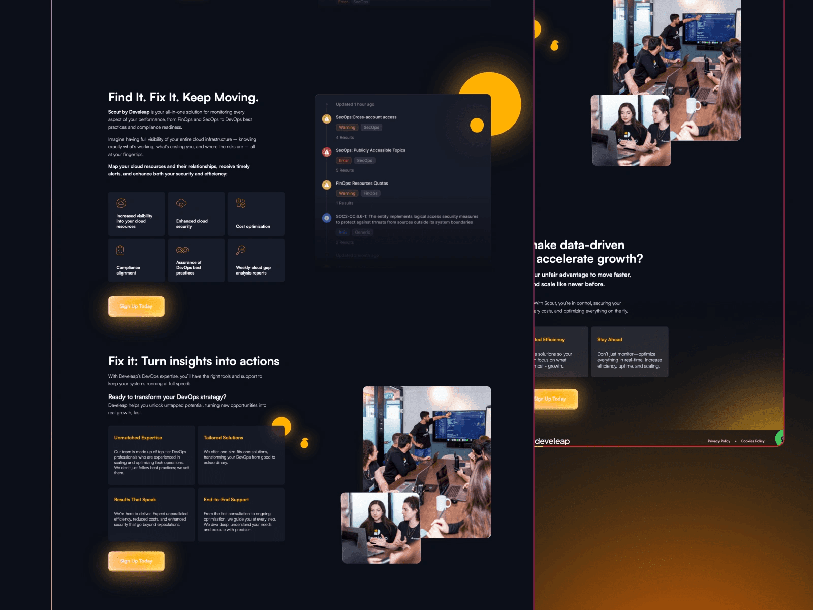
Develeap is a top-tier DevOps service company, but their old site didn’t reflect that. The messaging was a bit scattered, the visuals felt flat, and the UX didn’t guide visitors toward conversion. It needed more clarity, more energy — and a lot more personality.
Solution
I rebuilt the entire experience with a sharper story, cleaner flows, and a design system that feels both technical and friendly. The homepage hooks you fast, the services pages explain without overloading, and the contact flow is frictionless. Bonus: everything’s built to scale as the team grows.
Their PM said, “For the first time, our design feels as modern as our work.” That’s the goal.


Credits
Closing Thoughts
DevOps is already complex - your site shouldn’t be. This was about making things feel simple, smart, and scrollable.
Services
B2B
Service Website
Technical UI
Performance-Focused
No-Code Build
Tools
Framer
Figma
Web Strategy
Component Design
Visit Live Site