Marcura
Designing for clarity and confidence in
the complex world of maritime finance.
B2B Design
Maritime SaaS
UX Simplification

Challenge
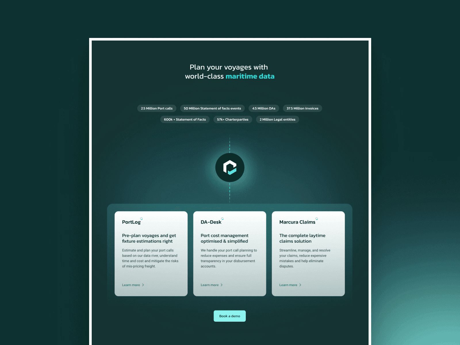
Marcura needed a serious refresh. Their old site didn’t reflect the scale or credibility of the company—especially for enterprise clients in the maritime industry. It was outdated, cluttered, and didn’t convey the trust and sharpness they’re known for. The goal? A cleaner, more confident design that actually supported their positioning.
Solution
I worked with their team to translate their vision into a modern interface. We simplified the layout, built in clarity across every page, and highlighted their expertise without overloading users. The new design feels bold but measured—exactly what a B2B fintech player needs. I focused on hierarchy, flow, and small moments of polish to bring the brand forward.
This was the first time I used inspiration from shipping lanes to guide visual layout spacing. It actually worked. Design nerd win.


Credits
Closing Thoughts
This was the first time I used inspiration from shipping lanes to guide visual layout spacing. It actually worked. Design nerd win.
Services
Corporate Redesign
Responsive Web
Content Clarity
Information Architecture
B2B UX
Tools
Figma
Framer
Grid Systems
Typographic
Visit Live Site